Calm colours for a minimalist home

Carmine Van Der Linden and Thomas Geldof
A calm, tranquil home does not have to be white. Or beige. Or cream. If you love a space with depth, and wonder how to add colour to a minimalist home, here are six palettes with soothing qualities that will create interest while supporting inner peace.
When introducing colour to a minimalist space, it’s essential to hone in on what your intention is for this space so it can align with your needs. If comfort and relaxation are your priorities, you’ll want to surround yourself with restorative colours, which tend to be on the cooler side of the spectrum. If you’re looking to feel inspired, warmer shades will provide the sense of happiness, optimism and motivation you seek.
However, the density of each colour is as important as its actual shade to create the right mood. For example, some blues have been found to lower blood pressure, slow the heart rate and cause the body to relax, others to trigger sadness and feelings of depression. Likewise, reds can represent excitement, passion and danger, but dulled down to a softer density, they can provide just the right amount of warmth to feel pleasant and welcoming. Like all things in life, it’s all about finding balance. On the whole, saturated hues will tend to accentuate a colour’s effect, while softened versions will create a more harmonious environment.
Muted colours will therefore be the most calming. They have a matte, tactile quality that is key when you know that our sense of touch has the ability to reduce stress and anxiety. And for that very reason, we recommend matte finishes too. If you need more contrast, add a little shine with glazed or metallic detailing, but overall, the more matte and tactile, the more relaxing the atmosphere you’ll create.
Each of the palettes we’ve put together below takes into consideration the neuroscience and psychology of colour, and each has a strong connection with the natural world, another vector of calm and serenity. Bring them to life with simple handmade decor pieces and imperfect surfaces, which will provide further tactility, so necessary in our digital area.
WARM EARTH

This is an elegant palette of earth-based neutrals, enriched with modern fiery tones. With a mix of red and orange undertones, it evokes feelings of warmth and heat. The colour of fire and love, red is associated with happiness, wellbeing, and good fortune in many Asian countries such as India and China. Here, its density is copiously toned down and it is softened with texture and creamy contrasts. With its light browns and beiges balancing the heat of the reds, this colour scheme will create an environment that is both energetic and grounding.
How to use it :
Because of its red cast, this palette is more appropriate for social rooms such as the living room and kitchen.
You can make the rooms brighter by focusing on the light shades of the palette, or richer and cosier by using wider expenses of the deeper tones, for example on the walls and floors.
If you are looking for the tactility of natural materials, exposed bricks and traditional tomette tiles are perfect for this scheme, as are raw woods and timber.

Sella

Studio Prineas

Burowhite

Abdel and Marijke
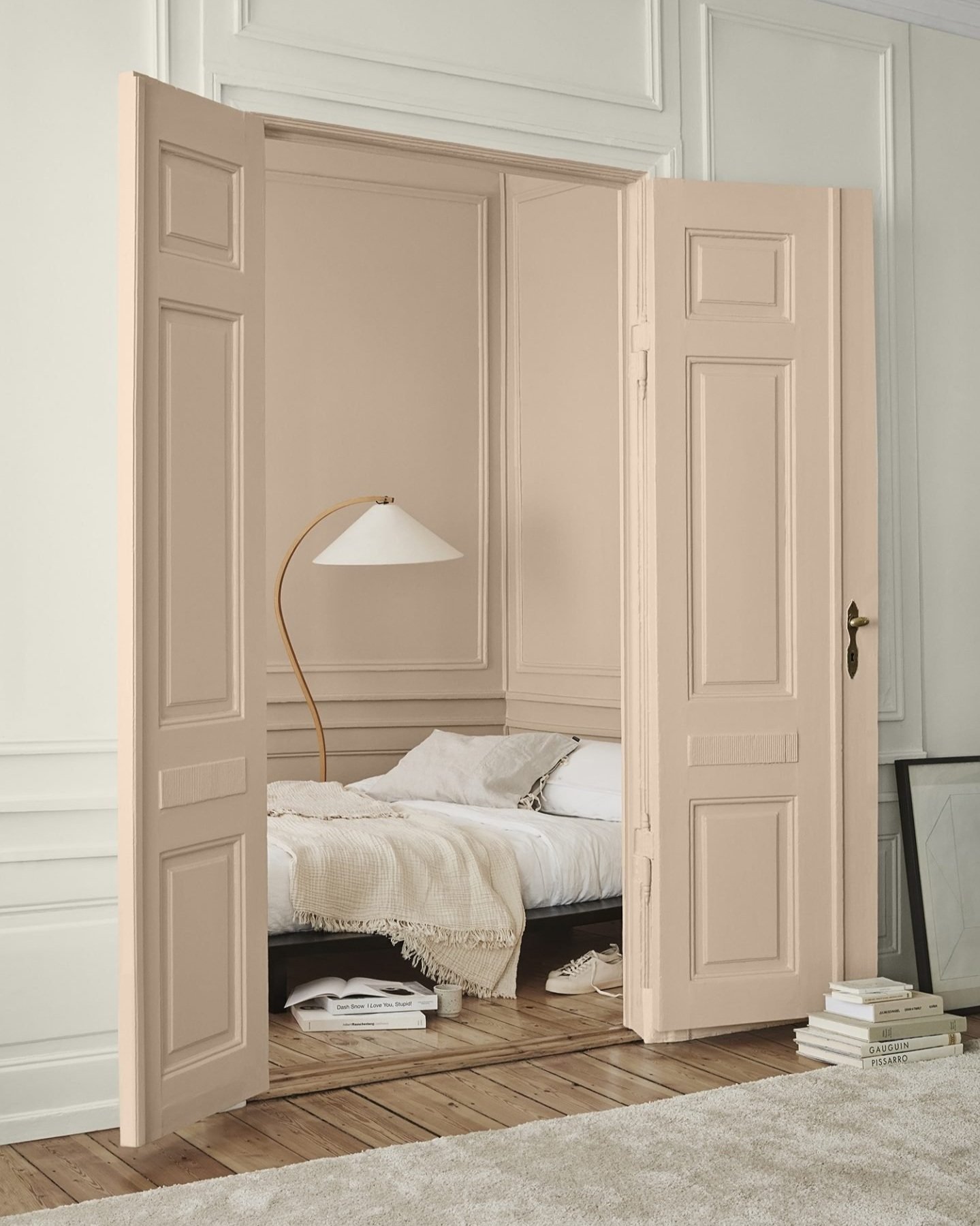
GENTLE BLUSH

Pink is widely regarded, at least in the Western world, as the colour of femininity. In fact, it was extensively used in the 70s and 80s to pacify men in detention centers and psychiatric facilities. It has been proven to soften moods and appease troubled minds.
This delicately dusty palette invites kindness and intimacy. Its sensual, soothing quality makes it ideal for bedroom or bathroom decor.
How to use it :
Use accessories in natural materials such as rattan and wood for the warm, cinnamon shade.
Painting an entire room with one of the softer shades of pink will create a snug boudoir retreat. The effect will be all the more appealing if the adjacent rooms stay white.
If you’re just trying your hand with colour, start small by painting the woodwork such as skirting boards, doors or windows, to draw attention to the most interesting details of the room.

Scandinavian Stylist

Matri
Jotun Lady

Ilaria Fatone
TRANQUIL NATURE

This simple, durable and honest palette may well be my favourite on this page. It’s definitely the one I am most eager to implement in a real-life project! The colours have a very low density that makes it super mat and tactile, and I love how the creamy white brightens it all up. The greens, browns, and reds have a dulled-down, muddy quality that feels organic but also modern. The overall look communicates a sense of wholesomeness, for natural, comfortable, and yet refined interiors.
How to use it :
These tinted neutrals are suitable for all types of rooms and will bring an equal sense of calm to kitchens, bedrooms, studies, or hallways.
For walls, choose textured finishes such as limewash to increase visual tactility. Likewise, prefer textured textiles such as hemp, linen, and wool for curtains, sofas, and blankets.

Fiona Lynch

Apartment 34

Bauwerk x House of Grey
Luceplan
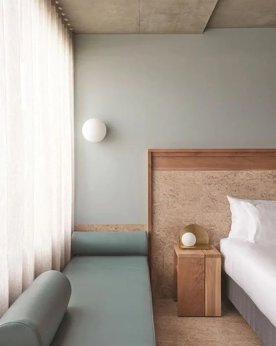
FRESH NEUTRAL

This is the freshest, most youthful palette I’ve put together for you. Built around a gently whitened blue and green, it conveys optimism, enthusiasm, and a sense of refined simplicity, but remains calming, relaxing, and subdued.
Being associated with the sea and sky, blues have inherent calming qualities, while greens call forth visions of growth and renewal. Used together, and alongside organic browns and greys, they evoke the healthy balance of nature. A cool white represents simplicity and brings a clean, modern quality to this scheme.
How to use it:
Use the green or blue as a base, for statement walls or upholstery.
Accentuate the youthful edge of this scheme with geometric lines and graphic shapes, but keep it grounded and organic with natural materials such as wood, cork, and stone.

Kennedy Nolan

Ilaria Fatone

The Calile Hotel
The Calile Hotel
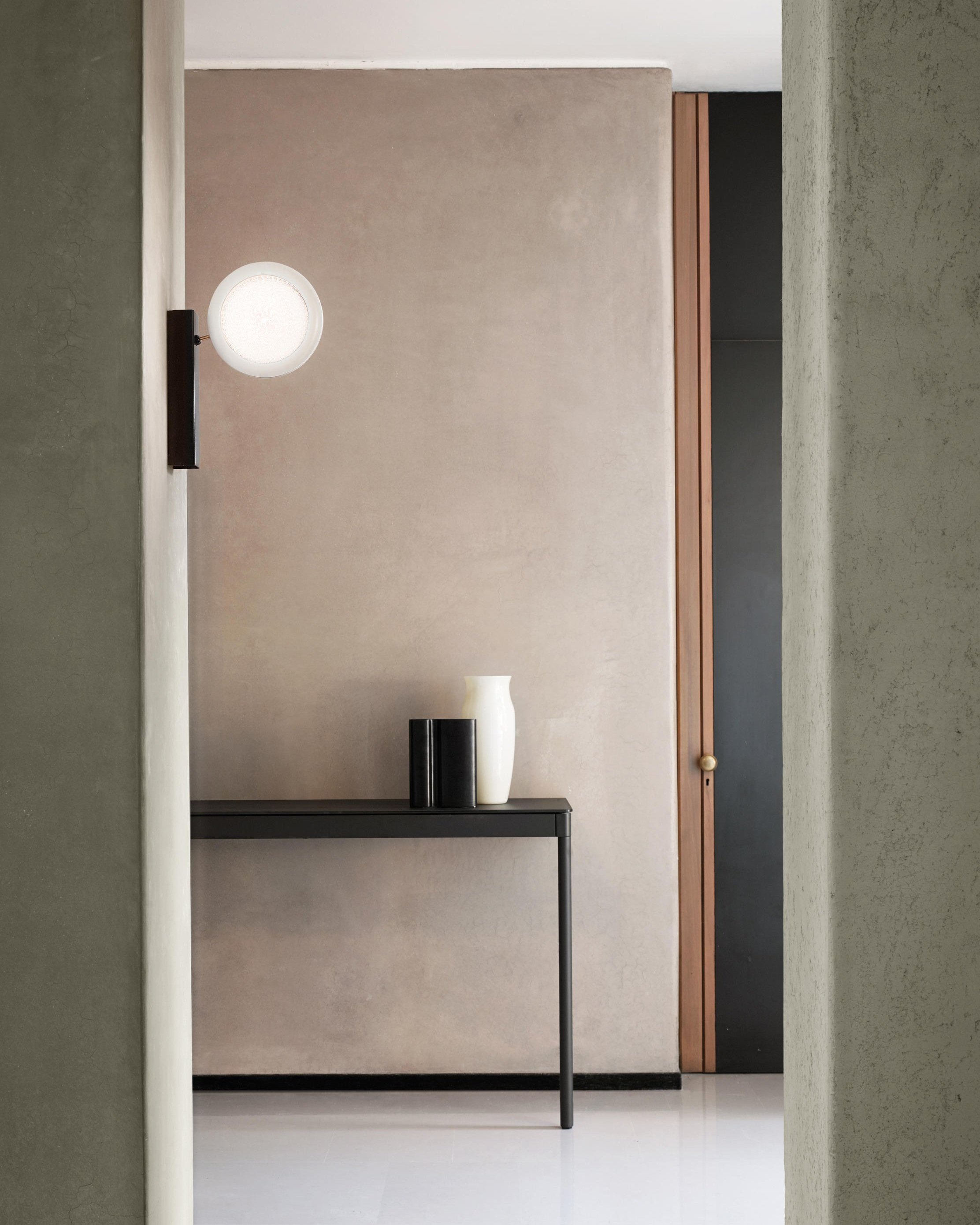
CLASSIC

A sophisticated palette of simple neutrals, heightened by a deeper, stronger grey. The lighter tones have a Yin quality, airy and feminine, while the darker shades bring the Yang element, grounding and masculine. The meeting of both is what makes this palette harmonious and balanced.
The safest option on this page, it’s great for beginners in colour. The various warm beiges create a classic neutral backdrop for pause and contemplation, while the stronger accents ensure it doesn’t feel dull or boring.
How to use it:
Use any shade in the palette, in any amount. These classic neutrals are designed to work together and will look stunning no matter what.
Choose one of the lighter shades as the base for walls, for a lighter feel. Accessorise with cushions or linens in dark accents. Reverse if you’re looking for a cosier, more enveloping ambiance.

Mikael Lundblad
Nordic Design

Bauwerk x House of Grey

@loft208
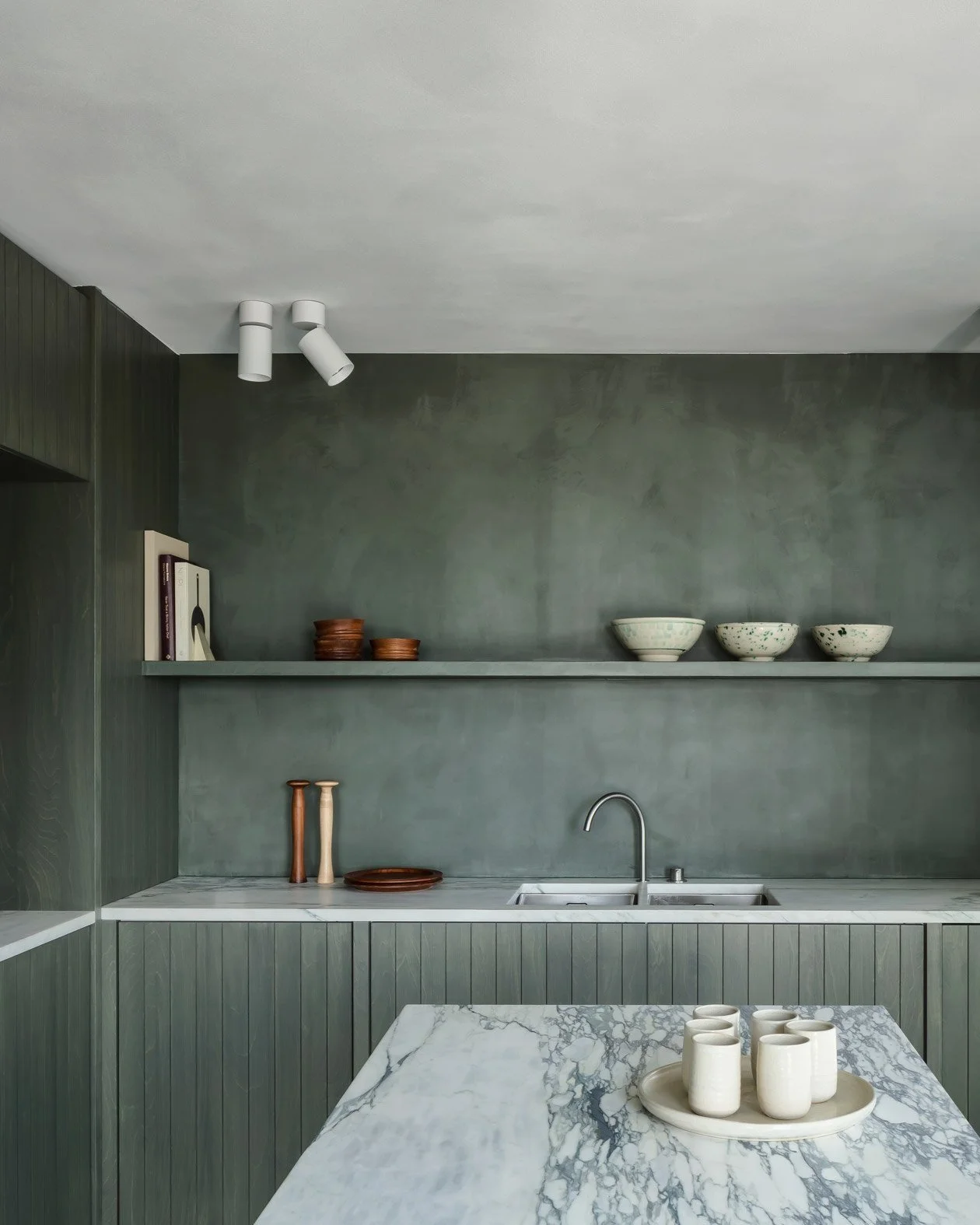
SOLID GROUND

With a focus on greens, this palette has a reassuring, grounding quality. Green is a common symbol of growth and wealth, both in the natural and literal sense of the word. In the collective mind, it represents plant life but also money, so when we’re exposed to the colour, we tend to think of abundance and stability. Here, the darker shades of green convey a sense of richness and depth, reinforced by the mat, textured black. The earthy tones of grey stoneware and red clay create a subtle contrast and bring warmth and light to this cosy scheme.
How to use it:
Use the mossy green shades of the palette on the lower part of walls or on low kitchen cabinets to further accentuate the grounding appeal of this scheme.
For a more daring, truly immersive feel, paint an entire wall in a textured effect such as limewash.
Use terracotta pots or wooden accessories for the reddish, illuminating accents.

Dulux
Carmine Van Der Linden and Thomas Geldof

Ewert Leaf

Kinnasand


Receive our free guide:

Subscribe for your free download to create a calm, natural sanctuary.
Need help with your own home?

Find out more about our interior design services.